In this article
- Introduction
- 1. Show the product clearly, not just beautifully
- 2. Make variant selection impossible to misunderstand
- 3. Put delivery and return answers near the decision
- 4. Replace vague claims with specific proof
- 5. Give the primary action enough space and context
- A five-minute product-page trust audit
- A trustworthy product page answers the next question
A Shopify product page feels safe to buy from when it clearly shows the product, makes variants unmistakable, answers delivery and return questions, supports claims with proof, and presents one confident buying action.
Key takeaways
- Clarity builds trust more reliably than extra persuasion.
- Keep delivery and return answers near the buying decision.
- Test the entire buying block with real mobile edge cases.
A polished product page can still make customers hesitate.
The problem is often not the colour palette, animation, or photography. It is uncertainty. A visitor cannot quickly confirm what they will receive, which option is right, when it will arrive, whether they can return it, or what happens after they click the main button.
Good product-page design does more than attract attention. It gives customers enough clarity to make a comfortable decision.
Use this five-point checklist on one of your most important Shopify product pages.
1. Show the product clearly, not just beautifully
Lifestyle photography creates desire, but it should not replace useful product information.
A strong gallery normally helps the customer understand:
the full product shape
important details and materials
scale or fit
available colours
the product in use
For fashion, include front, back, detail, and on-body views. For home products, show dimensions in context. For digital or technical products, use real interface or feature views rather than decorative mockups.
Audit question: Could someone understand the product without reading the description?
2. Make variant selection impossible to misunderstand
Customers should always know which colour, size, material, or configuration is selected.
Weak variant interfaces hide unavailable combinations, use tiny colour circles without names, or change the product image without confirming the selected option. This creates doubt at the most important moment.
Use clear labels, visible selected states, useful availability messages, and variant-specific images when they help. Do not rely on colour alone to communicate state.
Audit question: Can a customer confidently explain exactly which version they are buying?
3. Put delivery and return answers near the decision
Shipping and return information is often buried in a footer or policy page. That may be technically complete, but it is not useful when the customer is deciding whether to add the product to the cart.
Place a concise delivery estimate, shipping threshold, pickup option, or return summary near the product form. Link to the full policy for details.
The goal is not to overload the page. It is to answer the next likely question before hesitation grows.
Audit question: Can the customer find the delivery and return basics without leaving the buying area?
4. Replace vague claims with specific proof
Phrases such as “premium quality” and “made for you” are easy to write and hard to trust.
Specific product information is stronger:
material composition
dimensions
care instructions
compatibility
warranty details
what is included
verified customer feedback, when available
Do not add badges, testimonials, or urgency messages that cannot be supported. Trust is damaged when visual persuasion feels stronger than the evidence behind it.
Audit question: Which claims on the page are supported by visible details?
5. Give the primary action enough space and context
The add-to-cart area should feel like the natural conclusion of the page, not another element competing for attention.
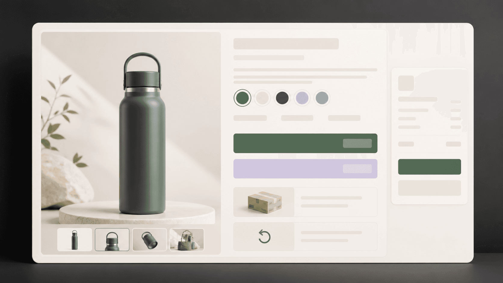
The product title, price, selected variant, quantity, availability, and primary action should work as one clear decision block. Secondary actions should not overpower the main one.
On mobile, test the page with real content, long product names, sale pricing, unavailable variants, and error states. A clean desktop layout can become confusing quickly on a smaller screen.
Audit question: Is there one obvious next step, and does the customer know what will happen after taking it?
A five-minute product-page trust audit
The gallery answers practical product questions.
Variant names and selected states are clear.
Delivery and return basics appear near the buying area.
Product claims are supported with specific information.
The main action is obvious on desktop and mobile.
Do not redesign the whole page at once. Find the largest unanswered buying question and fix that first.
A trustworthy product page answers the next question
A trustworthy product page does not need more noise. It needs fewer unanswered questions.
Beautiful design earns attention. Clear product information, visible policies, understandable options, and a confident buying path help customers act.
Appexa designs practical Shopify experiences that balance clarity, speed, and premium presentation. Use this checklist internally, or contact Appexa when you need a deeper storefront review.